

Writer's Update Feb 7, 2026
My Thoughts on Book and Cover Design and How Lotus Became a Hero of the Story

In this post, I share my thoughts on book and cover design, spiced up with a nerdy detail on how a Silver Lotus became a hero of the story.
From layout to images to sound, this poetry book was shaped by a series of decisions that favored control over convenience. Familiar tools, manual workflows, and repeated revisions replaced automation and efficiency.
Simply because familiar tools kept the process transparent for me, though not necessarily easier.
DIY Book Design
= Owning Your Choices and Mistakes
I made a deliberate decision early on not to invest in traditional writing or layout software for this project. Tools like InDesign and other professional publishing suites were an option, but they would have added both cost and friction. I wanted speed and familiarity.
I chose Canva instead. While it is technically a paid tool, the cost is reasonable, and more importantly, it is an environment I know how to navigate with my eyes closed.
That choice didn’t actually reduce my workload, on the contrary. A large part of the layout became manual by necessity. Every element had to be placed, adjusted, and tested individually.
On Adding Friction by Choice
Because why not..?
You can design a poetry book by word, and be done with it. That is perfectly valid solution. But why would I do that, since I can spend sleepless nights pouring my heart into design details?
Illustrations
The images in the book started as Midjourney generations. Getting AI illustrations to meet both my personal requirements and print quality requirements meant resizing and refining details to work at larger scales.
What looks finished on screen often falls apart under print specifications. Though I have a system in place for this, this stage was slow and occasionally frustrating.
I even considered leaving images out all together, as I wrote in my previous article.
Every image that made it into the book earned its place by surviving my mental pressure.
Soundscape System
The same applied to the audio layer. I created Soundscapes using Suno (AI), then edited the tracks to better match the context requirements.
This all adds layers and layers of friction to the process. But in the end, it’s totally worth it, since soundscapes expand the book beyond the page.
Audio sample of Poetry with a Pulse: Is this what we worked for?
Technically my soundscapes are far from perfect. I don’t even have the skills to evaluate them properly, but I hope they add an extra emotional layer for readers.
After that came the less visible work.
Each poem is paired with a QR code that leads directly to its audio counterpart. Encoding the files, organizing them, and hosting them on a server that allows access without requiring reader registration.
And when it comes to Kindle version, QR codes become obsolete. I figured an other way of adding Soundscapes to each poem. Manually, of course.
Are QR Codes Wort It?
I have embedded QR codes for each poem, allowing readers to listen while reading, and added visual elements to support the atmosphere of the text.
Canva offers a very simple tool to add QR codes, as long as you make sure they are function correctly. You cannot just link to Substack, you actually need these links to be never, ever, ever changing URL:s.
None of this was difficult in isolation. QR codes require an eye for a detail and patience and consistency. And an unhealthy amount of editing rounds and testing, and in the end they will leave doors wide open for human error.
I would say still, so worth it!
Once you get your copy, I’d love to hear your take on this.
About Cover Design
You can dive into this topic as deeply as you wish. It’s truly a bottomless weld.
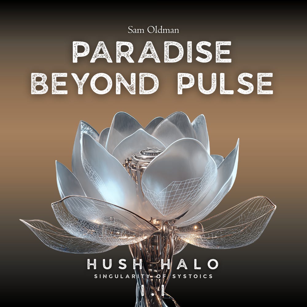
My cover took longer than I initially expected, because I realized that I needed a concept, not just a cover. The first version worked on a technical level and it was great for both sci-fi genre and poetry. But it didn’t carry enough weight to represent the book as a whole. Once I stopped trying to force a solution, a clearer direction began to surface.
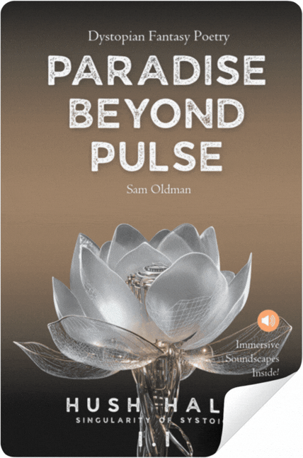
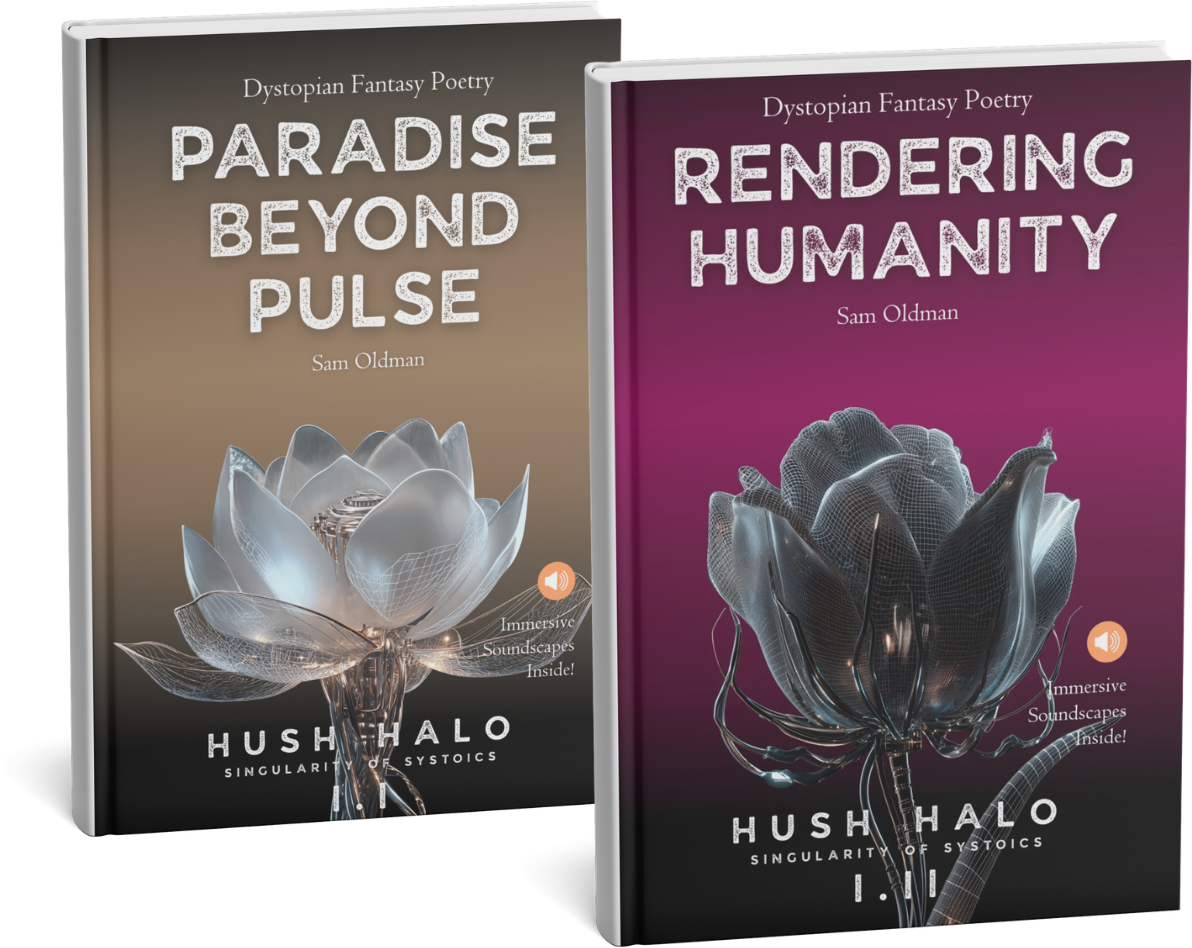
That direction became the alien flower concept. It felt immediately expandable, not just as a single cover image, but as a visual language for the entire Hush Halo poetry line.
The flowers suggest something unfamiliar yet deliberate, organic but not natural in any recognizable way. They tell a story without explanation.
Next Level: Bringing Alien Flowers to Life
In the cover of Paradise Beyond Pulse is a single Silver Lotus Exogenous Morph that also warranted its own nerdy detail, a small botanical note at the end of the book.
GIF’s and MP4’s
Once the visual identity started to feel coherent, it became difficult to see it as something fixed to a single format. Midjourney’s ability to generate short video sequences opened up a door for this alien beauty extend beyond the printed page.

This is next level, but i love it. I’m not there yet, but looking ahead, animated and GIF based covers feel like a natural next step, especially in digital contexts.
Fictional story behind my poetry is not static but in it’s core, already already pointing onward. I feel that movement adds another layer of meaning without requiring additional explanation.
Looking back, I’m not sure all this testing or anything in my approach saved time.
No, actually I am sure: It didn’t.
But all this designing surely made every layer of the book feel earned.

Did you miss my previous posts?


WHAT IS HUSH HALO?
Hush Halo is a dystopian fantasy poetry collection set in a near-future shaped by technology, silence, and optimized perfection. Each poem is paired with its own immersive soundscape. Learn more in Square One.
Context: After the Great Optimization, a privileged group integrated into the system, believing they had now perfected themselves.
POETRY · WRITER’S UPDATE · BUY BOOKS · SHOP · LINKS
Hush Halo is an indie art project.
To follow and support my work, consider
becoming a free or paid subscriber.
🖤Feeling it? Share your thoughts ↓
Oh wow, creating a multimedia poetry book is laborious! Uh, just publishing a regular book is almost too much. It’s coming out today, isn’t it? Exciting! Congrats 🎉
I use Canva as well. Why not?